Visualizing the “Blue Wave” – Center for Data Innovation

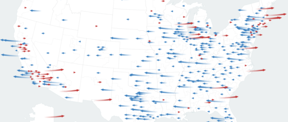
The New York Times has created several data visualizations comparing the results of the 2018 and 2016 U.S. House of Representative elections, illustrating how the supposed “blue wave,” in which many expected Democrats to win a large majority, played out. The visualizations show which districts flipp
