‘Design is a collaborative effort’ – Jordan Design Studio on Graduate Institute of Innovation – Australian Design Review

Graduate Institute of Innovation by Jordan Design Studio is a coworking space designed for developing the skill set of the next generation of Australian scientists.
Completed over the course of 24 weeks, this project met two briefs.
Functionally, the client required a space with a reception, platform, booth seating and kitchenette. Visually, they were after a calm aesthetic that prompted collaboration.
“The client placed significant trust in our process, so we had a lot of creative freedom when it came to the design and we’re proud of the end result,” says Jordan Design Studio founder Sophie Jordan.
British-born but now based in Sydney, Jordan launched her eponymous studio on the cusp of the pandemic in March 2020.
“In 2018 I made the jump over to Sydney from London. While working for a Sydney-based practice, like so many practices, in March 2020 the projects slowed right down. However, I was fortunate that a client reached out at that time. I took this as a sign and threw caution to the wind!”
Located in Gregory Hills, New South Wales, the Graduate Institute of Innovation is an opportunity for entrepreneurial graduates to thrive in their chosen field of study.
To get a better idea of how Jordan approached this interesting coworking space, ADR caught up with the budding designer to learn more.
ADR: How did you workshop elements of hospitality and residential design into the project?
Sophie Jordan: What I love about hospitality design is the opportunity to create experiences for people. You can take patrons on a journey and evoke a particular mood. With residential design, I love the opportunity to provide a haven, to craft a well-designed space that evokes happiness for our clients. These elements are incorporated into this project, as we needed to entice people back into the office given the impacts of COVID on working life. We wanted to avoid making the place feel clinical at all costs and take them to a workplace that simply makes people feel good.
Why was this blend of experiences important?
SJ: Each zone has a slightly different design language to create contrast throughout the space and create a different experience. We used an organic sculptural design for the platform seating to shy away from the typical office box. This was juxtaposed with the rectilinear shadow lines used in the reception to bring a touch of the unexpected.
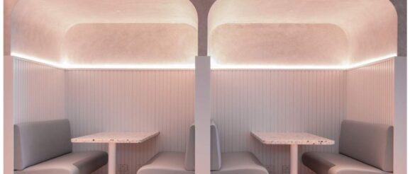
The collaborative seating used soft sculptural furniture and a custom pendant to make the area feel relaxed, while the bold use of stainless steel and black stained timber was selected for the kitchenette. Considerable thought was given to the layering of the light through the selective use of LED strip lighting and wall lights to enable visual comfort.
What inspired your colour palette? How did you ensure the space didn’t feel too dull or clinical?
SJ: Design is a collaborative effort. Each client brings something different to the table and here the client was after a calm office environment. It felt like a natural choice to use warmer off-white tones that would contrast against the black and lighter shades of timber. We wanted to avoid the white-painted plasterboard look so layering was crucial to bring warmth into the space.
We played with the material’s textures and tones, and an off-white powder-coated metal mesh inlay grid ceiling enables glimpses through to the industrial exposed ceiling. Concrete overlay flooring was paired with herringbone timber floor, while the area rug and curved floor junction helps make the space not feel clinical. The delicate broken colour of the Porter’s French Wash was paired with the stable look of the timber battens wall cladding.
How did you ensure the space fostered collaboration and well-being?
SJ: As collaboration was a crucial aspect of the brief we felt it was important that the collaborative seating area was placed at the centre (heart) of the workplace. The booth seats are semi-enclosed to foster intimacy and were placed next to the kitchenette to add to the informal setting.
As we know natural light and planting improve productivity and may even reduce sick days. Therefore the desks are perpendicular to the windows to provide natural light and motorised sheer roller blinds were used to block out any distracting light. We utilised planting to bring warmth and life to the space.
Lastly, how do you want people to feel in this space?
SJ: We want to inspire creativity for the next generation of entrepreneurial graduates in their chosen field of study. We want them to feel uplifted, relaxed and engaged in an environment that contributes to the diversity of thought and innovation.
It’s no secret that dynamic workplaces help people do their best work. This prompted Herman Miller to create problem-solving designs that are as beautiful as they are helpful.
