Heritage Melbourne home is reborn as a modern dwelling filled with light and views | Inhabitat – Green Design, Innovation, Architecture, Green Building

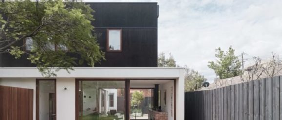
Fitzroy-based design studio Field Office Architecture has given a small 19th-century Victorian terrace a contemporary facelift with walls of double-glazed glass and crisp, clean lines throughout. Dubbed the Clifton Hill House after the suburb in which it resides, the compact home sits at the end of a row of similar heritage houses and had been given many ad-hoc renovations over the years. The architects stripped back all of the additions to bring in light and views, while improving the home’s energy efficiency.
Commissioned by clients seeking a contemporary light-filled home with a new dining area, kitchen and master bedroom, the Clifton Hill House has been updated to 180 square meters with three bedrooms and two baths. On the ground floor, the entrance opens up to a long hallway that branches off to two bedrooms and leads to an L-shaped, open-plan dining area, kitchen and living room that wrap around a north-facing courtyard and also open up to a spacious backyard. Stairs at the rear of the property lead up to the study and master suite.
The light-filled home was also reinforced with high-performance insulation and features double glazing throughout. To minimize the use of air conditioning, the architects strategically placed operable windows to promote cross ventilation across both floors, while retractable insect screens protect against invasions of unwanted critters. Energy-efficiency is further achieved with in-slab hydronic heating in the living and dining areas. The landscaping, which was designed by the architects, is lined with seat-height recycled brick planters.
“A combination of dark feature timber framing along with marine grade ply and rendered recycled brickwork make up the primary material palette externally, a simple, affordable and yet robust series of selections that juxtapose elegantly against the heritage nature of the existing part of the dwelling,” the architects explain. “Internally, the selections were similarly made to provide a soft understatedness that allows for the artwork and the natural light to take centre stage.”
