St John’s Innovation Park invents ‘wonky cycleway’ – Cambridge Cycling Campaign

At Camcycle we look through many planning applications and write objections in cases where developers are proposing cycle infrastructure or facilities that do not meet the standards or requirements of planning rules. We normally work through the usual planning systems and try to get problems fixed through comments, feedback and discussions. However, in the case of this proposal from St John’s Innovation Park (20/03523/FUL) the developers wrote a perfunctory response to our initial objection and did not bother to fix the actual problem that we highlighted with their cycleway design.
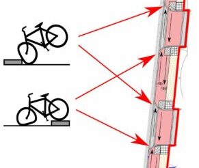
In this case, the problem is so embarrassingly bad that we feel we have no choice but to draw public attention and shame their behaviour. They have proposed a two-way cycleway where, at every driveway, the route is elbowed aside and any cyclist who might dare to ride it is sent tumbling into or over a tall kerb. Below is a snippet of the developer’s drawings (‘surface finishes plan’), showing some examples where driveways interrupt the cycleway (coloured in pink). We have added black arrows and bicycle symbols to show the claimed bi-directional flow of cycling. Since this is a plan view, the 3-D implications of the drawing are not necessarily obvious to the untrained eye. Our ‘visualisations’ show what would happen should someone attempt to ride on this ‘wonky cycleway’:
We’ve taken a photo of an arbitrary road and edited it so that it looks like what would happen if road designers were to build ‘wonky roads’ in the same way as the proposed ‘wonky cycleway’:
The above is obviously a bad idea for a road, so we are left wondering how any designer in their right mind could possibly draw up such a broken cycleway. The answer will have to come from Townshend Landscape Architects as they are the company responsible for such a disastrous design.
The truth is that the designers have attempted to squeeze a quart into a pint pot. They have squashed a substandard cycleway next to a substandard footway into a space that is too small for both, and therefore the junctions and driveways are of a broken design. Furthermore, what’s not shown is all the street furniture such as lamp-posts and electrical boxes that will have to go somewhere: inevitably they will wind up in the ‘cycleway’ as further obstructions. There is also no space for landscaping, which is an awfully strange output from what is supposedly a firm of landscape architects.
We have long campaigned for proper landscaping to be included alongside roads. It is not only because we like trees and planting, which we do, but also because such space makes it possible to properly accommodate all the functions of a road and to design junctions and driveways in a reasonably coherent way.
For example, this entirely unremarkable junction in Rotterdam shows how it could be done:
This two-way Dutch cycleway is fairly wide and designed for higher cycling flows than what’s needed in St John’s Innovation Park. While not a perfect example, it nonetheless demonstrates the following essential features: continuous cycleway and footway with well-marked priority for cycling and walking; lamp-posts and poles do not intrude into the cycleway; separation of the cycleway from the carriageway giving drivers better visibility of people cycling here; a kerb separates the cycleway from the footway, helping people with partial sight; tactile paving is kept on the footway where it belongs and does not appear improperly on the cycleway; and much of this is made possible by the landscape zone between cycleway and carriageway.
It doesn’t have to be a landscape zone though. This example from Romford in London (courtesy of @maidstoneonbike) shows many of the same features as the Rotterdam example but the designers chose to have a more minimal style of buffer zone rather than landscaping. This extra buffer allows the cycleway and footway to subtly and gently shift away from the carriageway at the vehicular cross-over in order to accommodate the dropped kerb:
The road design is fairly basic and unadorned, but it is simple and easy, and it puts the road user hierarchy in the correct order with pedestrians as top priority, followed by cyclists. That’s how you make a road that is suitable for people of all ages and abilities.
When designers in the UK attempt to lay out roads without that landscaping or any buffer zone at all they find that it is impossible to do these things correctly, so they do them badly instead, and we end up seeing abominations like the ‘wonky cycleway’ as a result. Such badly designed infrastructure is not suitable for anyone and winds up either causing injuries or not being used.
Hopefully as designers become more familiar with Local Transport Note (LTN) 1/20 we will stop seeing disastrous designs and start seeing more proposals come forward that look more like the Dutch examples. It’s right there in the introduction, the five principles of design with accessibility for all embedded in each one:
A ‘wonky cycleway’ is neither coherent, safe, comfortable nor attractive. LTN 1/20 should be required reading for all officers, engineers and architects who may be designing cycle infrastructure, so that they can better understand these matters.
In the meantime, we will be objecting strongly to the planning application from St John’s Innovation Park (identifier: 20/03523/FUL), and we encourage others to submit objections as well. The deadline is Thursday 11 February.
You can use the online planning portal, or submit comments by email to [email protected] (don’t forget to mention the identifier). Feel free to copy to us ([email protected]) and to the local district councillors Judith Rippeth ([email protected]) and Anna Bradnam ([email protected]) who are both on the Planning Committee as well.
