The thing that impresses me most about Leica? Its innovation

| Ok, so maybe there’s still room for innovation when it comes to memory card access. |
It might sound odd to discuss the innovations of a company whose best-known product is anachronistic to the point that you have to take the baseplate off to change the film memory card, but I’m serious.
I know I’m supposed to be impressed by the company’s history, its (rather outdated) use as a press camera and the stellar reputation of its lenses. But I’m not, especially*.
I love that Leica doesn’t just have crazy ideas, but that it turns them into workable, purchasable products.
It’s not that the lenses aren’t great. It’s just that I’m not terribly impressed a company’s ability to make single focal length, manual focus lenses good when money’s essentially no object and you can individually correct every one if you have to. My experience of working as an engineering journalist always reminds me that it’s many times harder to produce a kit zoom that has to offer decent performance at multiple focal lengths, offers fast autofocus for both stills and video, includes image stabilization and can be made with a degree of consistency for something like $35.
But while I’m not that fussed about all that ‘red dot’ business, I love that Leica doesn’t just have crazy ideas, but that it turns them into workable, purchasable products. Even if they’re not necessarily the most affordable ones.
Take an ‘e’ (off the word Monochrome)
The Bayer color filter array is amazing. It lets spectrally-indifferent sensors perceive color and does so with a good level of resolution and fairly few downsides. Except that it steals around a stop of light.
| I love the idea of a mono-only second camera. But perhaps not one that costs more than my (admittedly ludicrous) road bike. |
So why not make a mono-only camera? None of the softness and noise that comes from demosaicing, and better, cleaner image capture because you’re not letting a series of color filters absorb half your light. That’s a great idea, why doesn’t someone do that?
Well, Leica has, with the Monochrom series of cameras. They do exactly what you’d hope: produce super-detailed mono images.
Of course, given that you have only one ‘color’ channel, it becomes more important than ever to avoid clipping, so I wish there was monochrome camera that didn’t meter by looking at the light reflected off the stripes painted on its shutter blades. Also, since it would need to be a second camera for me, I’d prefer it to cost less than a small car. But I have to applaud Leica for doing it, rather than just thinking about it.
What’s the opposite of Iconoclasticism?
Again, who would have thought it’d be Leica: a camera brand that added a faux winder lever onto its latest camera, that would design one of the most innovative user interfaces of the past decade?
Love it or hate it, the icon-led touchscreen interface of the Leica T series is one of the few genuine attempts we’ve seen to completely re-think how you should interact with a camera and its settings. Interestingly, the person I’ve met who dislikes it most is also one of the few I know who owns a digital Leica rangefinder (though that could be because the first iteration had some interesting quirks). Personally, though, I thought the design struck a good balance between command dials that controlled the primary exposure parameters while letting you tap and swipe the settings, just as you might on a smartphone. Certainly an ambitious thing for a ‘traditional’ camera company to do.
Settings? There’s an app for that
On the subject of smartphones, it’s long been suggested that they might provide a solution to the uncontrolled menu sprawl that’s overwhelming even the best-designed modern UI. Connecting cameras to smartphones over Bluetooth and Wi-Fi is becomes ever more easy and ever more commonplace, just as the complexity of menu options becomes unbearable, so why not pass-off responsibility for settings to the phone?
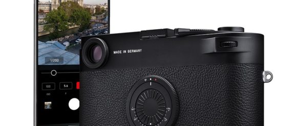
| Handing off responsibilities for camera settings to a smartphone app makes great sense. I’m not sure the same is true of taking away the rear screen or adding a faux-winder ‘thumb rest.’ |
And, if looked at from a certain angle, that’s what Leica’s M10-D does. I’m not necessarily convinced that it made sense to keep going and take the entire LCD screen away but pushing set-and-forget settings off to a smartphone app I could get behind. An app can offer a nicer interface with better guides and instructions, meaning the on-camera interface can be stripped back to focus on the main shooting parameters. But perhaps leave me a screen, eh, Leica?
You can’t be serious?
I don’t want flippant tone to completely undermine my sincerity. I genuinely am more impressed with Leica’s innovative thinking than the specifics of its products. I’d love to see some of them more widely adopted. Like having a 36 x 24mm image capture area, that might take off.
* Full marks to every comment or blog post concluding that I don’t ‘get’ Leica. To be clear, I love shooting with its rangefinders. They deliver a unique shooting experience that every keen photographer should strive to have. Even if I wouldn’t necessarily recommend spending the cost of a hatchback (or a nice road bike) on one. [Return to text]
