Using Interactive 3D Graphs to Increase Learning in Calculus Classes – Duke Learning Innovation

Each semester, over 300 students enroll in multivariable calculus (Math 212) classes, most of whom are first- and second-semester undergraduates. Multivariable calculus is foundational for many degree programs across the University, including economics, business, life sciences and engineering. In an effort to bolster student success in this course, I collaborated with multivariable calculus instructors to develop manipulatable 3D teaching tools that can be embedded in Sakai pages.
Why is calculus so hard?
Multivariable calculus is notoriously difficult for many students, particularly because mastery hinges upon visualizing functions in multiple dimensions. One- or two-dimensional calculus, which is taught in high school (and is plenty difficult itself) can be adequately represented in a two-dimensional space, such as a chalkboard (i.e., a chalkboard has length and width).
In contrast to one- or two-dimensional calculus, multivariable calculus involves three or more dimensions. It is possible to represent three dimensions on a chalkboard by portraying depth (imagine drawing a 3D cube), but this becomes increasingly difficult as the graphs become more complex.
A MATLAB solution
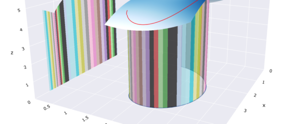
To help students visualize 3D graphs, Duke math professor Ingrid Daubechies developed a series of MATLAB programs that produce interactive 3D figures. Using a set of on-screen controls, students can zoom, rotate, pan and save 3D images in different file formats. Dr. Daubechies found that the manipulatable graphs helped her students better understand what the functions were actually doing.
Dr. Daubechies incorporates these figures into her lectures, often pausing between slides to open MATLAB, which she uses to present and manipulate the plots. Students are provided with the original MATLAB code so they can reproduce or modify the figures on their own computers (MATLAB is free for Duke students).
Increasing accessibility
Dr. Daubechies noted that, while the MATLAB plots were useful teaching tools, they required students to download and run software – a potential barrier for widespread use. Daubechies reached out to Learning Innovation to ask how she could make these teaching tools even more accessible to her students.
To make the visualizations more transportable, I transcribed Dr. Daubechies’ MATLAB code to a different computer language, Python, and then programmed the figures using the Plotly Python library. The new figures not only have the same zoom, rotate and pan features as the original MATLAB plots, but they also include additional interactive functionalities, including buttons, sliders and annotated parameter values. I wrote the code using Google Colab notebooks, a cloud-based alternative to the popular Jupyter Notebooks. The figures can be easily modified and updated by anyone with the shared links to the notebooks.
After creating the figures in Python, I exported each figure as an html file. Then Learning Innovation’s Megan Lancaster embedded the figures directly into the Math 212 Sakai site. Now, all multivariable calculus students (not just Dr. Daubechies’ classes) can access the visualizations from the course Sakai page, without the need to install or run any additional software.
We created a separate Sakai site to showcase some of the visualizations developed for this project. All Duke users can access the site. The figures designed to illustrate ‘optimization under constraint‘ and the ‘path integral‘ are some of our favorites.
