Visualizing Bicycle and Scooter Travel Patterns – Center for Data Innovation

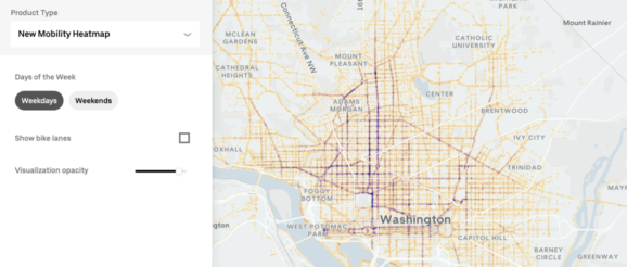
Uber has created a data visualization tool called the New Mobility Heatmap, which maps bicycle and scooter travel patterns to specific streets. The tool visualizes the data for eight cities, including Brussels, Paris, and Washington, D.C., and can help researchers understand where these modes of transportation are common. In addition, the tool can help city planners identify areas to expand bike paths. For example, San Francisco’s map shows a significant amount of biking activity along Fisherman’s Wharf, even in areas where there is no bike path.
