Visualizing Climate Change – Center for Data Innovation

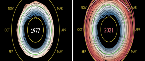
Ed Hawkins, a climate scientist at the University of Reading, has created a visualization depicting changes in temperature anomalies from 1880 to 2021. For each year, a spiral is drawn representing the degree to which temperatures increased or decreased in each month relative to a base period of 195
